Ecology Systems
Logo Design
Logo Design
|
|
Illustrator
Illustrator
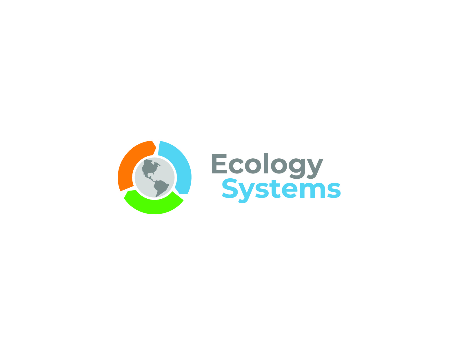
Ecology Systems is a renewable energy company, and they asked me to design their logo. The goal was to create a visual identity that shows their commitment to clean energy and helping the environment. The design features a globe surrounded by arrows that point inward and outward—representing the continuous cycle of renewable energy. The colors are inspired by nature: orange represents the earth and soil, blue stands for water and oceans, and green symbolizes plants and growth. These three colors work together to create a memorable logo that clearly communicates what Ecology Systems does.
Ecology Systems is a renewable energy company, and they asked me to design their logo. The goal was to create a visual identity that shows their commitment to clean energy and helping the environment. The design features a globe surrounded by arrows that point inward and outward—representing the continuous cycle of renewable energy. The colors are inspired by nature: orange represents the earth and soil, blue stands for water and oceans, and green symbolizes plants and growth. These three colors work together to create a memorable logo that clearly communicates what Ecology Systems does.
Ecology Systems is a renewable energy company, and they asked me to design their logo. The goal was to create a visual identity that shows their commitment to clean energy and helping the environment. The design features a globe surrounded by arrows that point inward and outward—representing the continuous cycle of renewable energy. The colors are inspired by nature: orange represents the earth and soil, blue stands for water and oceans, and green symbolizes plants and growth. These three colors work together to create a memorable logo that clearly communicates what Ecology Systems does.
Keywords
Up Next
Cultura Fit
Cultura Fit

Healing Twins
Healing Twins